Game development is a beast, and development teams are often behind when running internal or external playtesting, making it challenging to focus feedback on key areas to make informed decisions.
To combat the state of the game, most teams lose momentum by having to schedule time out from their day-to-day work to guide someone in real-time whilst they take part & often, feedback can be biased.
With our latest updates, life will be better for everyone, and you'll have the flexibility to be creative for a wide range of needs. This playbook (guide) has been designed to give you time back to relax at home or in the office while people give you meaningful insight 24/7.
WHAT'S CHANGED?
For those who have been using the Go Testify platform for a long time:
- The old welcome message & special instructions have been combined into a new ‘Test Brief’, visible within the 'Plan' section of the test setup.
- The new test brief has been enriched to support images, video, audio clips & links
- The task system has been updated to have the same capabilities and has had a number of visual updates on our recorder to provide people with more clarity when following instructions.
WHEN TO USE A BRIEF, TASK OR A COMBINATION
To decide which approach is best or what may need to be communicated, you need to:
- Outline the logistical steps you require someone to take as if you were describing everything in person. E.g. For this test we would love for you to review our Steam page before playing the game for 30 mins.
- Determine if you want people to play naturally or focus their thoughts on specific aspects.
- Identify what may potentially hinder someone from providing the critical insight you need from the test.
If, after doing that activity, you:
- [a] Don't have any issues or steps to communicate with someone, then you don't add a custom brief or tasks.
- [b] Want people to interact without any direction but do need to provide known issues; a short custom brief will do the job.
- [c] Require people to follow a series of steps or focus feedback across different sessions; then, a combination of a custom brief and tasks will be important.
Brief - Pros & Cons
| Pros | Cons |
|---|---|
| Great for outlining high-level information (What activities people will undertake, any special instructions people should adhere to before they begin & displaying a list of any known Issues...) | Adding too much information makes it hard for people to retain. Keep it concise, or consider using images or video to communicate more in fewer words. |
| When someone participates, they will first see the brief & confirm they have read it before they start recording or are provided any tasks. | You can only add one brief per test; however, you can chain two or more tests together using our new custom completion message. Find out more here |
| It's always accessible with the recorder if people need to refer to it later in their session. | Tasks become the default screen when someone starts recording, so don't use tasks if you require people to refer to the brief often. |
Task(s) - Pros & Cons
| Pros | Cons |
|---|---|
| Great for guiding people through complex steps, as you can use a variety of methods (video, images and even links that open in a separate browser) to communicate in detail. | Tasks don't show on screen until people are recording; however, this design intentionally ensures people focus on those critical tasks after taking a test brief on board earlier. |
People won't be overwhelmed with too much information at once because participants can only view one set task at a time. | Adding too many tasks will make it hard for people to complete playtesting activities within a set time limit, as they will need to digest the information before providing feedback. Allow for more time in your plan. |
| As Tasks show, when recording starts, they can be used to capture additional insight into various aspects not yet implemented into the game, such as trailers, new features or even character development. | As with briefs, too much information will make it hard for people to retain and provide focused feedback. |
Great to use when games are early or late in development, as you can visually direct people to areas in the game to focus feedback and outline specific topics you would like to learn more about; as if you were interviewing them. | |
| As tasks are viewable when recording, you can enhance your PC security measures when distributing standalone builds (Zip Files) and request people to record them, removing and deleting the files off their machine. |
WHEN BEST TO USE VIDEO, IMAGES OR AUDIO FILES TO COMMUNICATE EFFECTIVELY
Less is always more when communicating to a broad set of people; however, below is an overview of the benefits of each type, what to keep in mind, and some downsides that need to be taken into considered.
Video
These can be uploaded (max 100 MB)to the platform or embedded.
| When to use (Examples) | Do | Cons |
|---|---|---|
| To re-create the in-house approach remotely. If you personally brief a test or task, people tend to appreciate the personal touch and invest more time to provide you with in-depth insight or commit to longer playtesting. | Keep the video under 1 minute, and if there is a lot to cover, consider splitting the brief up into other video clips that could be used within dedicated tasks across sessions. | Not every team member wants to be on camera, and if it's too long, people may disengage before digesting critical information. |
| To evaluate marketing material or provide people with more context about the story/lore of the game | Keep in mind that having videos will eat into any playtesting time. | Depending on when you showcase this material, it could be biased or skew playtesting feedback. |
| To guide a complex series of actions which need to happen quickly or showcase how to use a debug menu for A/B testing. | Consider if it can be broken up into a series of tasks or if images or gifs can give you the same value in less time. | Can be time-consuming to record the actions & communicate effectively first-time. |
Images
| When to use (Examples) | Do | Cons |
|---|---|---|
| To direct people to an aspect of the game you want specific feedback on. | Combine multiple images into one image to communicate more in less. | Portrait Images typically take up a lot of space on the person's screen. |
| To ask specific questions on UI or symbols in the game to assess comprehension. | Remember that it could bias or skew feedback depending on when you showcase this imagery. | Using this method could result in a lot of tasks for people to complete, and if using your own participants could result in early drop-off. |
| To showcase people new areas of the game that don't exist in the build. | Place this type of imagery in a task rather than a brief, as it will easily get forgotten. | Feedback on future additions can result in mixed feedback, making informed decisions challenging. |
Audio
These can be uploaded (max 100 MB)to the platform or embedded.
| When to use (Examples) | Do | Cons |
|---|---|---|
| If you wish to provide a personal brief or task instruction without recording a video or using text and imagery. | Keep audio clips brief, and consider splitting the communication into multiple tasks if complex to remember. | Needs to be used in combination with text to ensure people don't miss the action you wish for them to take. |
| To evaluate audio samples or music not yet integrated into the game. | Consider adding a series of audio clips to one task rather than one per task. | Using this method could result in many tasks for people to complete, and if using your own participants could result in early drop-off.... |
Finally, web links are great to use when the platform can't communicate what you need via the brief or tasks added; however, keep in mind any links interacted with will open in a separate window outside of our recorder.
GOOD & BAD EXAMPLES
Not everyone is a master of design; however, taking the time to follow best practices when you're creating a brief or a task will ensure people follow your steps & provide you with detailed feedback.
Volume of text & formatting
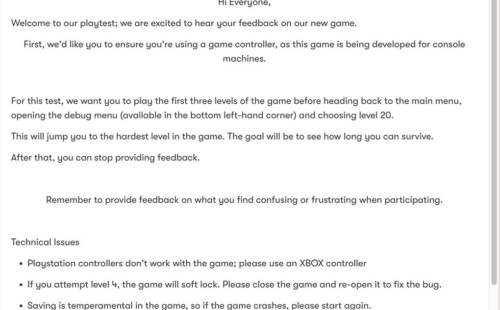
Bad Example
Using too much information in an unstructured way makes it challenging for people to digest and retain.
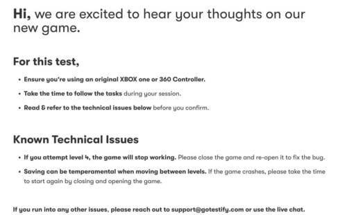
Good Example
The message is concise & uses formatting effectively to make it easier for someone to focus and digest.
Not providing enough context
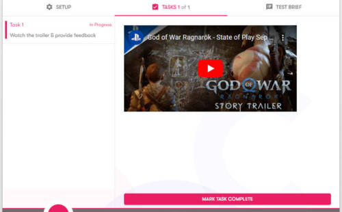
Bad Example
The title of the task outlines the activity but not what you want to learn from watching it.
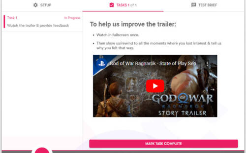
Good Example
People have more clarity about when you want to hear their thoughts and what you want to understand.
Referencing terminology not everyone will understand
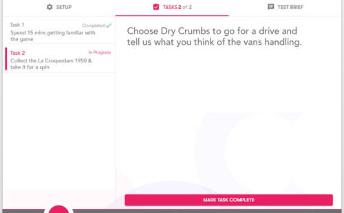
Bad Example
People may struggle to locate, as they may not have engaged with that menu, or built up the understanding of the game's terminology.
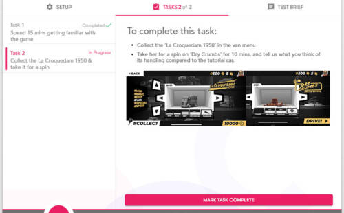
Good Example
To reduce confusion, general direction has been improved and more clarity has been provided with imagery.
Not breaking up your brief into tasks
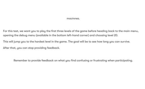
Bad Example
The brief is overloading people with tasks, and what they want to learn too early.
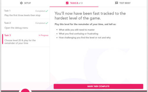
Good Example
The brief and tasks work together to provide clarity as they step through the test.
Have an idea that could improve the platform
We'd love to hear how you find the new updates and what further changes could save more time in your day;
Feel free to email support@gotestify.com with suggestions or reach out on live chat for more tips & tricks.